 Bedroom
 Coffee Tables
 Dining Tables
 Garden Decor
 Living Room
 Painting Art
 Wall Art


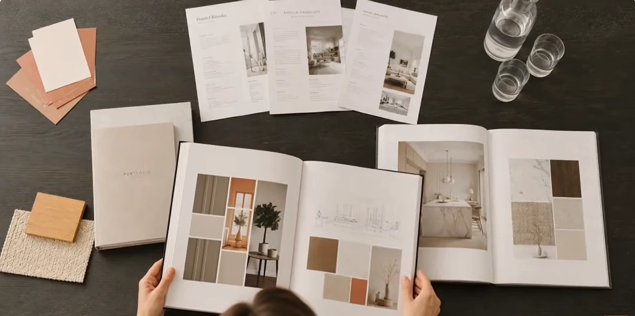
You don’t need ten finished projects to start an interior design portfolio. You need one room, a few decent photos, and a short, honest note about what you changed. That’s how mine began, and for longer than I’d like to admit, that one room was the entire thing.
My Sister’s Living Room Was the Whole Portfolio for About a Year
She had a brown leather sofa that she wouldn’t let go of (it was her first “adult” purchase, and she still brings that up), a rug about half the size it should have been, and a print hung so high you’d think it was meant for someone on a ladder.
I lowered the print. I bought a bigger rug on sale, the wrong color at first, so it went back. Then I turned the chairs toward the window instead of the TV, which she hated for maybe two weeks and then stopped mentioning.
The part I remember most is realizing, after all of that, that I had no before photo. I dug through her phone and found one from a birthday dinner. The old rug is sort of visible behind my nephew’s head. That’s what went in the portfolio. It looked a bit ridiculous next to the after shots, but I didn’t have anything better.
Now I take before photos of every room I walk into, whether I’m hired or not. It’s a habit my sister finds a little weird.
“So Are You a Designer or a Decorator?”
Somebody asked me that at a family wedding, and I didn’t have a good answer. The difference matters for your portfolio, though, because people look for different things.
An interior designer portfolio usually has technical work in it: floor plans, elevations, lighting layouts. An interior decorator portfolio is more about the finished look, meaning furniture, color, painting art, and fabric. If your work goes into moving walls and changing how a building is laid out, you're closer to an interior architecture portfolio, and the drawings get far more detailed.I’m mostly a decorator who likes drawing plans by hand. My portfolio shows both, and I’ve stopped worrying about the label. A lot of people just call it an interiors portfolio.
Most Rooms Look Wrong in Photos Because of Scale
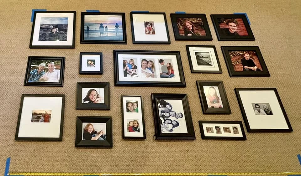
This took me an embarrassingly long time to understand. A room can feel perfectly fine when you’re standing in it and look strange on a screen, and nine times out of ten, something is the wrong size.
Wall art is the usual problem. A small print over a long sofa looks lost, and the camera makes it worse. I aim for art at roughly two-thirds the width of whatever sits under it. Coffee tables are the next offender. Too small and the seating looks like it’s drifting apart.
(Side note: I once spent a whole afternoon convinced a room’s paint color was wrong, and it turned out to be the lampshade. It was a warm, orange-ish shade, and it tinted the entire wall. I still think about that lampshade.)
Taking the Photos
My setup is a phone and a cheap tripod. I’ve never regretted skipping a fancy camera, but I did regret shooting handheld for the first six months.
- Turn off the overhead lights and shoot in daylight, because mixed lighting makes walls look two colors
- chest height, and keep the door frames straight
- one wide shot, a couple of medium ones, then close-ups
- move the TV remote. Then check again, because it’s always still there somewhere
What surprised me: the close-ups got more reactions than the wide shots. A lamp against a wall, the edge of a frame, a folded throw. People seem to trust the details.
A Project Page Doesn’t Need Much
I used to overstuff mine. Now each project gets a couple of sentences about what the room was and what the person needed, then the before photo, a hand-drawn plan, and the finished shots, plus one close-up I’m really happy with.
That’s it. If I have a photo of the fabric or paint samples laid out together, I’ll add it, but I don’t force a mood board onto every page.
One thing I’d tell anyone making interior design portfolio samples for the first time: fewer, better projects. I once padded mine with a quick guest bedroom job I didn’t love, and the first person who looked through the book asked about that room before any other. Of course they did.
For the portfolio design, I kept it plain: one font, lots of white space, and the same layout on every page. Nothing clever.
I Looked at a Lot of Portfolio Examples Before Making Mine
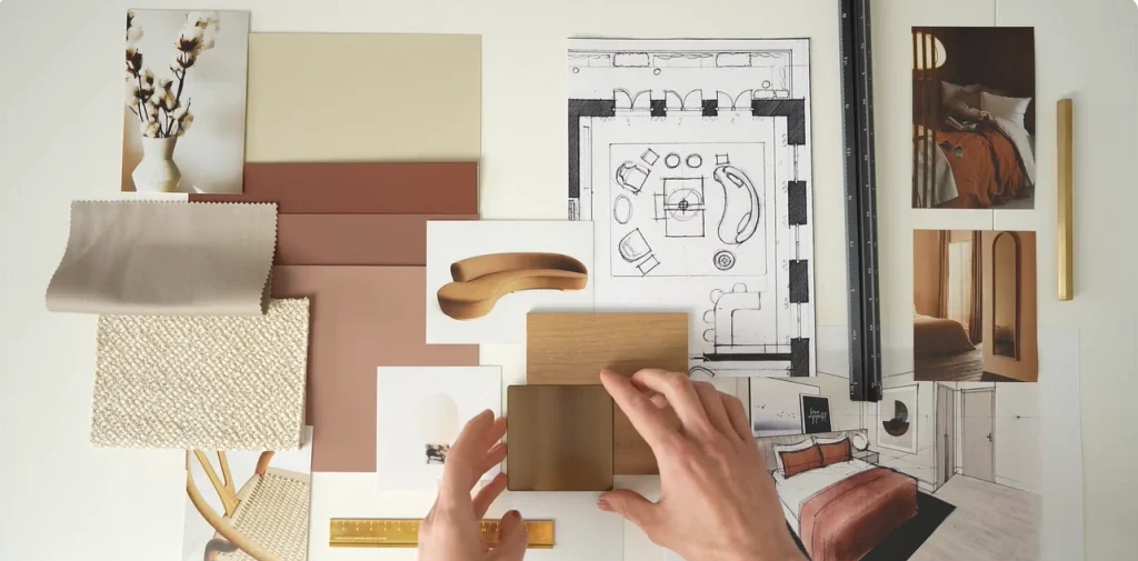
Probably too many. Printed student books, online collections on Behance, and the websites of small local studios. After a while, the best portfolio examples started to blur together in a good way, because they shared some habits:
- The best photo came first, even when it wasn’t their newest project.
- You could see a little of the process, like a sketch or a sample board.
- Captions were short, sometimes one line.
The weaker examples of interior design portfolios tended to open with a long “about me” page, or they were almost entirely computer renderings. I still go back and forth on renderings. I know people who swear by them. My instinct is that a real room, even a modest one, says more, because it shows the idea actually worked in a space someone lives in.
It doesn’t matter much what language you search in either. “Interior design portfolio” or “portofolio desain interior,” the good ones look alike.
Students Have It Easier (Sort Of)
An interior design student portfolio can be all class work, sketches art, and model photos, and nobody blinks. What reviewers want is to see how you think.
If you’re applying to FIT, their interior design program asks for a small set of original pieces, which can include drawings or drafted plans and elevations, along with a couple of short written answers. Go straight to their admissions page for the exact list. Schools change these things, and blog posts, this one included, go out of date.
A PDF First, the Website Later
I made a simple PDF from an interior design portfolio template, and that’s what I emailed around for the first year. The only thing I’d warn you about with templates is the photo boxes. A lot of them are small squares, and a wide room photo gets chopped in half.
The website came later and stayed small. The interior design website examples I liked had one big photo on the homepage, one page per project, and a way to get in touch. I copied that idea completely, and I don’t feel bad about it.
If I started again tomorrow, I’d ignore the website for six months and spend that time finishing a second room. Two real rooms in a plain PDF did more for me than any page design ever has.